
Brand colors are a crucial element in building a strong visual identity and brand recognition. However, choosing the right colors for your brand is not just about aesthetics, it’s also about accessibility.
Color contrast accessibility refers to the ability of people with visual impairments to perceive and distinguish between different colors. This is important because approximately 8% of men and 0.5% of women in the world have some form of color blindness. If your brand colors do not have enough contrast, it can make it difficult or impossible for some people to distinguish between them, which can have a negative impact on their overall user experience.
To ensure that your brand colors are accessible, it’s important to consider the contrast between them. The Web Content Accessibility Guidelines (WCAG) provide specific guidelines for color contrast ratios that must be met to ensure accessibility for people with visual impairments. These guidelines are based on the relative luminance of two colors and the contrast ratio between them.
Level AA
For digital experiences that must comply with WCAG 2.1 Level AA, the following are the bare minimum requirements for color contrast:
-
- Minimum 4.5:1 for normal text
- Minimum 3:1 for large text and graphics (large text refers to a minimum of 24px or 19px bold)
Level AAA
For digital experiences that must comply with WCAG 2.1 Level AAA, the following are the bare minimum requirements for color contrast:
-
- Minimum 7:1 for normal text
- Minimum 4.5:1 for large text and graphics (large text refers to a minimum of 24px or 19px bold)
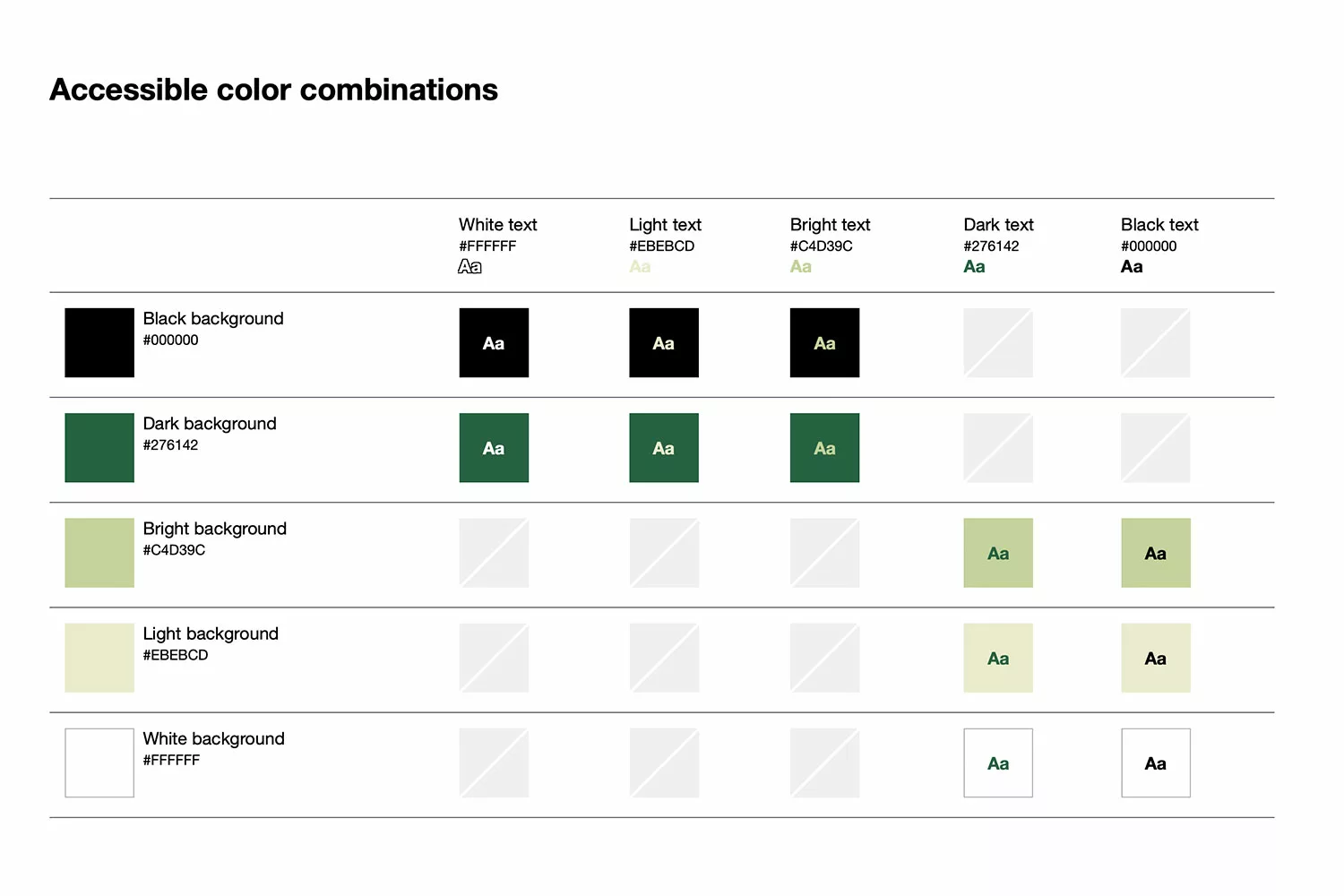
Here is an example from a research of color combinations that pass WCAG AA compliance.
By choosing colors with a high contrast ratio, you can ensure that your brand is accessible to all users, regardless of their visual abilities. Additionally, using high contrast colors can make your brand more visually striking and memorable, which can help to increase brand recognition and engagement.
Brand colors are an important part of building a strong visual identity, but it’s crucial to consider accessibility when choosing your colors as part of being inclusive and expanding your audience. By ensuring that your brand colors have a high contrast ratio, you can ensure that your brand is accessible to all users and create a more memorable and engaging visual identity. Need help choosing accessible brand colors? Let’s talk.
Thanks for reading. Subscribe to receive new posts.